To keep track of our research, planning and other work we used Blogger. This made all our work accessable at home allowing us to log extra research conducted outside of lessons and kept all our work organised. We were also able to plan lesson schedules and what outside work we needed to be done, it acted as a diary which kept us on time with deadlines.
We experimented with different ways to present our research on our blog and decided that the website Wordle would be able to show our text in an innovative ways.

Filming
Editing
During the editing we used Final Cut Pro. This allowed us to cut all cut the footage how we wanted it and to create a sequence. We also edited the music in Final Cut Pro. We cut out parts of the music and added in other sections to make the editing sound seamless. We also cut the end few choruses and used Final Cut Pro to fade out the soundtrack (shown in the image below).

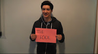
We used the crop tool on Final Cut Pro to edit the shots of people holding the placards. We filmed the footage around college and outside distractions could be seen, like posters etc. We cropped them down so that only the person and the placard was seen to keep the attention focused on them and to make the overall video look more professional.


We added a black and white effect to the video but came to the conclusion that it took away the liveliness of the video and the colour kept up the personality of the band and target audience. We were planning on adding colour accents to the video, however, due to time constraints and lack of knowledge in creating the effect we decided the footage, even though it was left without any effects, looked more effective and less tacky.
Digi-Pack
For the digi-pack we used Photoshop to edit the photos we took on the day of filming to use them in the digi-pack as central images on the front cover and back cover etc. We also took advantage of photoshops many different effects and editing tools; for example of the front cover with Elliot's tattoos we used various colour tools to create the desired effect. The writing on the tattoo was originally plain black but we used the colour filter to filter out the harsh dark colours and add in shades red to create the vibrant red writing we're left with now. We changed the contrast to make the hands a bright white colour, which worked well with the bright red colour of the tattoo and complimented each other really well.
We downloaded a font called SketchBlock from a font website called Dafont then we imported this font into Font Book. Dafont gave us the opportunity to find a font that linked in with the tattoo and the style of the band.

No comments:
Post a Comment