Tuesday 14 December 2010

Colour Accent Attempts

For our digi-pack we have the idea of having itin black and white with colour accents on the instruments. This effect would match the style of the music video. By using Photoshop I have practiced creating a black and white image with a prominent object in colour.


The effect looks quite professional and is achievable so this is an idea we can definitely use for the style of our digi-pack.

Thursday 9 December 2010

Production Schedule

  • We have secured the band for Thursday morning. We are hoping to film all of the band performance shots on the stage of Worle Community School on that day.
  • We will be using two cameras so we can achieve all the angles we are planning to use.
  • On that day we are also going to take some still photos of the band to use for the digi-pack.
  • We will need the band to bring their instruments for the live performance and we do not need any other props.
  • The filming of the different scenario shots will be done on a separate day.

Record Label

We designed a record label that went with the genre of the bands style, as though they could actually be signed by the company.

We went onto Da Font and found a punk style font that we liked the look of. We then downloaded it and created a simplistic logo for the record company. We came up with the idea of Graffiti Records because the font does not only suit the punk genre of the music but has a graffiti style to it.

Here is our record label that will appear on the back of the CD and on the magazine advert:


After researching into existing logos we made sure that our logo was as simple as possible but so the record companies name was clearly displayed. Since the logo will be small on the back of the CD case or magazine advert the bold font means the name is still visible.

Wednesday 8 December 2010

Research into Record Company Logos

We need to create a Record Company that would invest in the band and budget the music video. For this we have to design a logo to represent the company.

These are some existing Record Company logo:


Most Record Company logos are simple and minimalistic. We wanted ours to mirror this so it looked professional. Despite the simplicity they are very effective and the company names are clearly displayed in bold font. This makes them stand out easily which promotes the company efficiently.

Thursday 25 November 2010

Creation of the Album Artwork.

Today we have begun designing the album artwork and cover for the Digi-Pack. So far we have came up with one idea being;

  • The band fighting a Robot made out of instruments.
  • The band may be dressed up in superhero outfits.

We decided to try and design this because we believe that it suits the bands style and would portray them on the album artwork as what they're like, and would be fairly bright and colourful, following the trend the band seems to have.

Location Ideas

In the second scenario we are showing the singer (lead male) in a room with the girl changing person to show his relationships are constantly changing. After watching Paramore's video of "The Only Exception" we had the idea to film the scene in a restaurant with the female swapping in the chair opposite the male.


At 1:53 Hayley Williams, the lead singer from Paramore, is in a restaurant at a table for two with males queuing at the seat opposite her. We thought this looked effective but would not have the girls queuing but have quick cuts where in each shot the girl would have changed.

Filming Settings

For the first narrative we are filming a bench shot with two people on it. We took a few photos of various benches to decide upon which would be most suited for the shot we want to achieve.


We have chosen to use the red metal bench as the colour will give the music video a punk effect. Also we would have the option to film the background in black and white but keep the red bench as a colour accent, keeping up our original idea.

For the last scenario we are filming either on a beach or across a bridge for the setting where the argument takes place. We took some photos from different angles over a bridge which looked quite effective.


We are still going to look into whether a beach shot will look more effective or whether other bridges from around weston will be more appropriate.

Tuesday 23 November 2010

Our next steps 3

We have completed the test filming, storyboard and animatic which means we are now ready to focus on the filming and the promotional pack for our music video. We now need to:

  • Take photos of our filming settings
  • Upload them to blogger
  • Plan production schedule
  • Test some effects out (black and white and colour accents)
  • Start designing the album cover for the digi-pack and advertisement poster
  • Film all the footage with extra shots
  • Start editing

Animatic

This is the animatic created from the shots of our storyboard. Creating the animatic gave us an idea of how quick the shots have to be to keep up the pace of the music genre and also the shots have to be cut to the beat of the music to look effective. We edited the order of the shots and used some shots a number of times to increase the flow of the video.

Thursday 11 November 2010

Our next steps 2

Future plans:

  • Finish storyboard and upload to blog
  • Start animatic
  • Test shots of syncing music and shots
  • Upload camera angle test shots

Shot List

Shot 1: - Low angle pan of band
- Low key lighting

- No singer

(11 seconds)


Shot 2: - Close up of lead guitar

(12 - 20 seconds)


Shot 3: - Close up on drum symbols

(20 - 22 seconds)


Shot 4: -Panning shot whole band (no singer)

(22 - 41 seconds)


Shot 5: - Centre shot again

- Singer appears on stage

- Singer starts walking to the left (at 51 seconds) , holding the microphone (still singing) band still playing

(41 - 55 seconds)


Shot 6: - park bench (mid shot) - black+white shot

- 2 people sat on bench (one possibley being the singer) singer singing behind the bench

- Coloured hearts in background

- Singer starts walking away (1:02)

(55 - 1:04 seconds)


Shot 7: - Camera follows singer back onto stage

(1:04 - 1:16)


Shot 8: - Close up on drums

(1:16 - 1:17)


Shot 9 - Shot 12: - Quick cuts of band chnageing position

(1:17 - 1:26)


Shot 13: - Close up on drums

(1:26 - 1:27)


Shot 14 : - Close up on guitar

(1:27 -1:30)


Shot 15 - Shot 28: - Flash cuts of singer walking towards a different scenario

- Ending with pan

(1:30 - 1:39)


Shot 29: - Singer in a room (black and white)

- A girl is in the room with the singer, clothes are constantly changing colour/clothing to reflect the lyric of change

- Weekday subtitles in corner

(1:39 - 1:49)


Shot 30: - Close up on singer singing

- He then walks off out the room

(1:49-1:59)


Shot 31: - Singer walking (Camera tracking him)

- Singer walks past guitarist, camera then stops following the singer and focuses in on the guitarist

(1:59 - 2:08)


Shot 32: - Close up, tracking shot of guitaist

(2:08 - 2:32)


Shot 33: - Camera zooms ot to reveal the whole band ha appeared in the background, mid shot of band

(2:32 - 2:41)


Shot 34: - Close up on drums

(2:41 - 2:43)


Shot 35: - Close up of singer singing into camera

(2:43 - 2:54)


Shot 36 - 43: - Close ups on instruments gaining colour accents, lamps being turned on in performance space etc.

( 2:54 - 3:05)


Shot 44: - Colour cuts out. Band playing in shadow again, mid shot of them playing + close ups

(3:05 - 3:15)


Sot 45: - Cut to midshot of performance space; the area ignites with colour

(3:15 - 3:26)


Shot 46: - Cut to behind tracking shot of the singer and a girl walking down a beach arguing

(3:26 - 3:36)


Shot 47: - Scenario intercut with band performance

(3:36 - 3:46)


Shot 48: - Cut back to beach; couple still arguing

- Video ends with girl walking away, the colour on her fading off; A new girl emerges out of a crowd in full colour.

(3:46 - 4:15)

Thursday 4 November 2010

Mid Project Evaluation

How does your media product use, develop and challenge the conventions of real media products?

Use;
Develop; We developed the conventions by reworking camera techniques to enhance the viewing experience.
Challenge; Our media product doesn't challenge the conventions of real media products because we have stuck to

How effective is the combination of your main product and ancillary texts?

Our media product and ancillary task are effective at creating an identity for the band, Kids From The Summer. The colour scheme and lighting effects mirror the bands own personal style. We are using dim lighting mixed with colour accents for the video, the colour accents are bright neon colours which bring out the bands personality, since this is a promotional pack we are using the style of the video to connect the band with the audience. The album artwork will have the same colour scheme to link both products together.

The way we portray the band in the video will also be the same in the promotional pack and the image will reflect their genre of music.

What have your learnt from your audience feedback?

Have you used new media technologies?

Sunday 17 October 2010

Experimental Filming

This lesson we took a camera and tripod out around college to test out some of the shots we were planning on using for our music video. This gave us the idea of whether our ideas of how we wanted the video to look could actually be achieved with the technology we had available. The shots we tested were:
  • 180 degrees pan (from two different locations, joined to make a 360 degree pan)
  • 360 degrees pan (from a low angle and a mid shot)
  • Jump shot

The filming went well and we got a good feel as to what shots would create the best effects for our video. All of our camera angle ideas were achievable with the technology which meant we were able to start story boarding our final ideas.

Thursday 7 October 2010

Our next steps

  • Audience feedback/fan base research
  • Draft digi-pack by hand or on Photoshop
  • Create a storyboard for the video
  • Create a storyboard animatic
  • Experimental filming

Clarification of our Treatment

Our final concept for our music video involves a single camera centered in a room. The room will be split into three separate sections, one half for the band then the two remaining quarter for "love" and "lust" We will play out two different scenarios simultaneously in the love and lust section and then constantly rotate the camera in a circular motion to get shots of the band. The band will be playing in shadows with only certain features being visible in the light, as the video goes on we will add various colour accents onto certain things such as instruments etc.

Pitch One

In lesson we presented a pitch to our class members, overall our pitch went very well, here is some of our feedback;

Positive;
  • The blog is well organised with lots of detail
  • Lots of relevant videos to the Pop Punk genre and explanations to why they were chosen
  • Good information about the band and their album artwork
  • Great colours and the design on the blog was relevant to the band
Things to improve on;
  • Put audience research onto the blog
  • Research into the style of music and bands the members listen to
  • More ideas about lighting for our video
  • Practice tests for filming ideas to see whether they are achievable

Wednesday 6 October 2010

Video Effects

After developing our music video concept we decided to further evolve the idea by using post production techniques and various different effects.
Our idea involved having the band play in shadow, with only flickers of light to reveal certain parts of them. As the video continues color accents will be added to the bands instruments and various other things.


This video has a similar shadowy/black and white effect to the one we might use, with only certain bit in brighter light than the rest.


This video shows similar lighting to the type of diagetic lighting we could use, the band uses candles to light up their faces, whilst the rest of the video is in darkness.

We have also been looking at colour accents and how to incoperate them into video.


White Stripes "Seven Nation Army" is an example of this, the video is in black and white with certain items of clotheing and instruments in colour, this will be similar to the effect we would use.

To fit in with the bands pop/punk image we could use the accents to put cool effects on them and their instruments whilst they're playing, this will make it more appealing to the bands audience and enhance their image,
Saving Aimee's "Fresh Since 88" in an example of this

Tuesday 5 October 2010

Research into Album Artwork

Kids From The Summer are a Pop Punk band so to come up with ideas for our album artwork we research into existing Pop Punk album artwork. We were looking for particular conventions that would not only represent their genre of music but the personality of the band.

This is a band photo of Call The Cops. This is the look we want to achieve with the video by using the colour accents like they have used for the bikes. The photo is also good because the title stands out but the focus is split between the font and the band members.


This is the Album Artwork for Punk Goes Pop a compelation CD of different Punk bands covering the newest Pop songs. The main focus is the title which is effective because it catches peoples eyes straight away. This would be good for a promotional pack because the band would want their name noticeable.


These are the two Album Artworks for Farewell, a Pop Punk band similar to Kids From The Summer. There artwork is very bright and are both cartoons. This style seems quite common amongst Pop Punk bands. Using a cartoon image like this looks effective for the genre of music but because this is a promotional pack for the band using a cartoon will not show the band so a photo of the members will promote them more as individuals.


This is Paramore's newest Album Artwork. It doesn't follow the theme of the bright colours but to create the effect we want we could use a photo like this and add a colour accent as punk bands often go for bright, eye catching colours.


This is Ramone's Album Artwork. This is also like the Paramore photo but with the coloured font. A style like this is what we want to achieve for the video so a photo like this of the band could reflect our music video well.

Thursday 30 September 2010

Lyrics

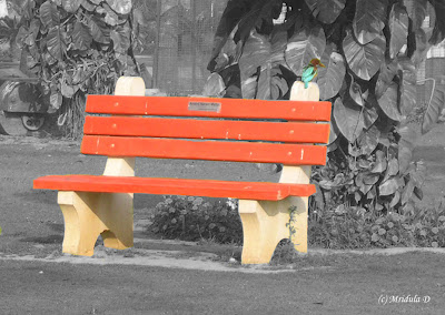
That bench never feels the same

Cuz we sat there every day

And all we did was talk

I found it hard to let you in

I found it hard to let everything

Go wrong

Well I guess I’ll leave you after all

After all I played fool for you

I played the fool for you

And this is where we met here

This is where we’ll leave it

And if you’re satisfied

And this is where you’ll leave me

And this is where you’ll kiss me

And if you understand

That bench never stayed the same

Cuz we saw it everyday

I always found it hard

And if I could I’d change my ways

I would change the way I am for

You

Instrumental

This is where we met you

This is where we’ll leave it

And if you’re satisfied

This is where you’ll leave me

This is where you’ll kiss me

And if you understand

Is this love or lust or are you gunna leave me x 7

Is this love or are you gunna leave me x 1

This is where we met you

This is where we’ll leave it

And if you’re satisfied

This is where you’ll leave me

This is where you’ll kiss me

And if you understand x 3

Music Video Ideas

Location; we have decided to use a large room which will make it easier to achieve the camera angles we want. We have three options so far that we need to check availability for; Worle Community school's stage, the performance space in the music block or the photography studio. The room needs to be empty and spacious with no distractions that will ruin the look of the music video.

Props; for the shots of the band we will only use the instruments they're playing to keep the focus on the band. For the narrative we will use props related to the scenarios, love and lust.

Effects; the shots of the band will have a shadowy (almost black and white) effect which will really help to emphasize the colour accents applied to the instruments and eyes. 
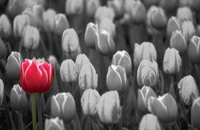
As the camera pans round to the shots of the narrative the colour will gradually change into normal colour without effects.

Aesthetics; the overall look of the video will be dark with aspects of colour representative to the themes of love or lust.

Thursday 23 September 2010

Word Cloud


Kids From The Summer's Album Artwork

To get ideas for our Album Artwork we researched previous Album Artworks created by Kids From The Summer. These two album Artworks don't have a specific style they follow, which gives us the opportunity to design an Album Artwork and digi-pack that represents the bands style how their fans perceive them.
View All Photos  Kids From The Summer

Change of Plan

After a group discussion we decided to use Kids From The Summer as they are willing to perform in the video. We have chosen to use "Love or Lust" because the lyrics have more meaning behind them which will inspire us more so we can create a storyline for the video.

By using Kids From The Summer we can design the video and digi-pack around their own styling and genre of music.


Tuesday 21 September 2010

Song Choice

We have decided to create a music video for the song "Kill the Director" by The Wombats.


We chose this song because it's got a good beat and the use of easy instruments and few band members will make recreating the look more achievable. Also the song has lyrics that are reasonably simple and tell a story. The song is not overly fast paced which will help us get the editing accurate. The song has a very indie feel to it which is the type of music we all listen to, this means we have a lot more inspiration for creative ideas.

Friday 17 September 2010

Email Responses

After emailing a few bands on MySpace we have recieved replies from; Friendly Fires and The Wombats.

Friendly Fires:
This is all good.
No worries.
Good luck with the project.
Ed :)

The Wombats:
of course..have fun!

By having two replies this allows us to choose a song we have the most imaginitve ideas for. We have also recieved a reply for Kids From The Summer who have given us permission to use one of their songs.

Thursday 16 September 2010

Ideas from Existing Music Videos

We researched into low budget music videos on YouTube to give us inspiration for ideas. Here are some of the videos that caught our eye:


"Something good can work" by Two Door Cinema Club. We liked this video because it was reflective of the type of budget at our disposal. It is shot in one setting with one camera angle but still looks effective.


"Say you don't want it" by One Night Only. This video was one of our favourites because we liked the idea of the intercut band performance in between shots of a story line. We also liked that it had a celebrity in it which would attract more attention to the video and band. We know that this is not something we could achieve in our video.


"New Romantic" by Laura Marling inspired ideas the most because of the simple but really effective lighting. She used shadows of key lyrics and other sillouette images projected onto plain walls which attracts the audiences' attention and helps tell the story.


Finding a band

In our first lesson we messaged a few bands from MySpace to get permission to use one of their songs. We contacted:
  • The Wombats
  • The Days
  • Mystery Jets
  • Friendly Fires
  • One Night Only
We also text a more local band, Kids From The Summer, to secure a safe deal. They have agreed to star in the video as well.

Brief

A promotional package for the release of an album, to include a music promo video, together with a cover for it's release on DVD and a magazine advert for the DVD.