Showing posts with label Tabby. Show all posts

Thursday, 7 April 2011

Evaluation By Tabby Jones

1) How does your media product use, develop and challenge the conventions of real media products?


Music videos have very vague conventions in which they should include which meant we could not really challenge any conventions as such. Different genres of music video contain convention typical to that style of music but overall, music videos can include anything the producers wants to. However, Goodwin proposed the theory that music videos should contain these 8 basic principles:


1) Link between the lyrics and visuals


2) Link between the music and visuals


3) Genre characteristics


4) Intertextual references


5) Notions of looking (objectification of women)


6) Voyeurism (direct gaze, other people looking at the artists, insights into the artists life, screens and mirrors)


7) Demands of the record label (representation of the artist)


8) Narrative based, concept based or performance based music videos


We tried to stick to these conventions in order to make our music video more successful as a real media product. We incorporated some of the basic principles but focused mainly on creating a music video that used conventions from the specific genre of pop/punk. We linked the lyrics into the video narrative with the use of placards containing key words from the lyrics. Different people were filmed holding the different placards.


We mirrored the use of placards from The American Rejects video for their song "Dirty Little Secrets" in our music video. They had secrets written on placards held up by different people so we adapted this idea to show the key parts of the lyrics. We also linked the music to the visuals by using quick cuts to show each placard in time with when the word is sung. The genre of our music video is pop/punk so we used the conventions typical of that style of music to make our video appealing to its target audience. Half the video was quick cut shots of a live band performance which is often used for this style. The shots were intercut with the footage of the placards. The quick cut pace worked well with the upbeat style of the band. We used close ups of the singer or other band members instruments to establish a visual comparison to key parts of the music, for example, when the lead guitarist plays the solo. We also used the convention of using genre characteristics through the bands fashion and we continue this into the digi pack, to link the two products together. The band members wore bright t-shirts with skinny jeans which is typical for the audience who listen to pop/punk music. The use of bright colours in the digi pack also ties into the fashion style which would make the package overall more appealing to its target audience.


2) How effective is the combination of your main product and ancilary task?


Our main product was a music video for a pop/punk band Kids From The Summer. We chose their song Love or Lust to create the music video for. To compliment this we also created a digi pack which included four CD panels and an advertisement poster for the music video we created and the release of the album.


To ensure that our digi pack, the four panels and poster, and the main product, music video, worked well together we had to keep running themes and styles throughout. This will make it clear to the target audience at a glance that the two products are combined.


We had difficulty with creating the desired effect for the music video because we were unable to film the narrative how we intended. This meant we had to change the design of the narrative section of our music video which resulted in us having to change the overall look of the digi pack in order to keep them consistent with one another.


The text of the digi pack and poster had to link to ensure the continuity of the two products, however this was a difficult task as the front cover of the digi pack is a photo of a tattoo with the words Love and Lust. Because the image is of a tattoo this meant replicating the font was a challenge. The back cover has the most similar swirly font to the tattoo we could find to make the product look more proffessional with the continuity. We did not stick with this font throughout the whole digi pack because the swirly font did not represent the bands style very well. Instead we chose to use a font, Sketchblock, that went well with the pop/punk genre on the inside panels.


On the poster we used the same Sketchblock font to show a clear link and used bright neon colours to make the poster represent the lively personality the band members and their music. The colours will also make the poster more appealing for the fan base as they are mainly following the pop/punk fashion which involves a lot of bright colours.


We then used the image of the tattoos from the front panel of the digi pack as the centre image for the poster. The image, alongside the matching font, with make sure that those interested in buying the album would easily recognise it from the advertisement poster if it was sold in store.


The image on the front cover of the album artwork is a photo of the lead singers tattoos. The tattoos are of the title of the song and can also be seen during the music video, they can easily be connected with the lead singer as a traidmark to him. By using the tattoos as the main image we linked the video and the band to the digi pack. Also because this is a promotional pack that is advertising a new band the branding of the tattoo can make the audience and fans relate to the lead singer and follow his style. Below is a screen shot from our music video where the tattoo is visable.


Once we had changed the narrative from a running story to quick cut shots of placards that showed the lyrics and song title, the digi pack did not link with the video. In order to keep this continuity between the two products we should have incorporated the placards within the digi pack to make the product as a whole more effective.


Both the video and the dig pack are representative of the band and the genre of music. This means both the products will be suited for the target audience, as the fan base is mainly of the same pop/punk style. The bright colours of the digi pack, funny pictures of the band members and quick cutting shots in the video all link into the style we were trying to portray.

3) What have you learnt from your audience feedback?


We showed our final copy of our Love or Lust music video to other media student, teachers and families to get a wide range of opinions on the final product as a whole. We also made sure we asked people who follow bands with a similar style to Kids From The Summer to see if we were successful in creating a music video that appealed to the right target audience. This is some of the positive and negative feedback we recieved:


1) Good band shots


2) Effective setting that suited the style of the music


3) I like the placards with the words


4) Quick editing was effective for the pace of the music


5) Simplicity was effective


6) Quick cuts in time with the music worked well


7) Repeating shots too long


8) Using the same person with the cards was noticeable


9) Placards looked as though you were filling space


Our audience feedback has taught us a lot about what works well and what is not so effective when creating a music video, especially in the style of punk/pop. Here is what we would consider editing, cutting or changing if we were to re-create our music video:


1) Follow the storyboard more and if the storyboard has to change we should re-draft it because it will give us a sense of direction and structure and we will know exactly what shots are needed


2) Film more footage so we have more options and a variety of shots


3) Practice with the effects beforehand with test footage as the effects would have enhanced the style of our video. Especially the colour accents as vibrant colours are shown throughout the digi pack and are traditionally related to the target audience


4) Make sure we do not use the same shot twice or shots that are too similar because it is very noticeable when watching back the final product. Once the audience notice this they are then distracted from the video itself


4) Have you used new media technologies?


Research and Planning:


We logged all of our research and planning onto Blogger which allowed easy access to all the information we had gathered. It meant we were able to look back and reflect on our research and this in turn made the creativity of our music video easier to achieve. This was because we were able to upload existing music videos so in the end we could collaborate all the ideas we liked from the blog and create our own music video.


Blogger also acted as a diary for us where as a group we could record what we had achieved in the lessons and what our aims and objectives were for future lessons. We could also set mini deadlines of what we needed to achieve and for when, and schedules so every member of the group knew what was going on.


We worked on presenting our information on Blogger in different ways. The technology allows us to embed videos from YouTube which meant we could have specific examples from existing media products that influenced our work on the blog. We could also include images from the internet which made the posts easier to follow because less words and more visuals made our planning clearer.


We used the site Wordle as a way to show some of our ideas. By adding in key words we were able to create a bubble or mind map of different ideas which we could later work with. This not only allowed us to show our ideas in innovative ways but made it clearer for us as a group to understand when it came to establishing our ideas.


Filming:


During this project we had new HD cameras available for us to use. This enhanced picture quality and also made the editing stage easier for us. The cameras use SD cards which makes the capturing of the footage quicker. In Final Cut Pro we had to Log and Transfer the files instead of Log and Capture. Log and Transfer enabled us to capture individual clips instead of the whole sequence of footage. We were able to film short sections of footage which meant each shot was easier to work with instead of having to cut the whole sequence into short sections.


Editing:


We used Final Cut Pro for the editing of the footage. The programme allows us to cut shots to the length we want and order them into a sequence. By using layering we had the shots over the soundtrack to make sure the visuals were cut in time to the music. We cut out parts of the music and added in other sections to make the editing sound seamless. We also cut the repeated choruses at the end of the song out to make the song a more appropriate time length to work with. Final Cut Pro allowed us to fade out the song when we wanted to. This meant it was not noticeable to the audience that we edited the end of it and made sure the song did not end abruptly (see image below).


We used the crop tool on Final Cut Pro to edit the shots including the placards. We filmed the shots around college and outside distractions could be seen, like posters etc. The crop tool allowed us to remove all of these and make each shot the same size, this meant the attention was kept completely focused on the person and the placard and gave an overall more proffessional look to the footage.
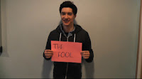


We added a black and white effect to the video but decided that it took away the liveliness of the video and the colour kept the personality of the band and target audience. We were planning on adding colour accents to the video, however, due to time constraints and lack of knowledge with Final Cut Pro in creating the effect we decided the footage, even though it was left without any effects, looked more effective and less tacky.


Digi Pack:


For the digi pack we used Photoshop to edit the photos we took on the day of filming. Photoshop allowed us to use a wide range of effects to create the look we wanted from just an ordinary photo. The front cover is a photo of the lead singers arms with the tattoos of Love and Lust. We used various colour tools to create the effect we wanted. The writing on the tattoo was originally plain black but we used the colour filter to remove the dark colours and replace them with shades of red. The red tied in to the bright colours that is traditional to the genre of the music. We also changed the contrast to make the hands a bright white colour. This worked well with the bright red of the tattoo.


The font we used was downloaded from a website called Dafont. We chose a font called SkeychBlock from a wide range of different style fonts. The site gave us the chance to find a font which best suited the bands personality and the genre of the music. Once we chose the font we imported it into Font Book which meant it was available to use in Photoshop.

Wednesday, 2 February 2011

Evaluation Question 4: Have you used new media technologies?

Research and Planning

To keep track of our research, planning and other work we used Blogger. This made all our work accessable at home allowing us to log extra research conducted outside of lessons and kept all our work organised. We were also able to plan lesson schedules and what outside work we needed to be done, it acted as a diary which kept us on time with deadlines.

We experimented with different ways to present our research on our blog and decided that the website Wordle would be able to show our text in an innovative ways.


Filming

During the creation of our music video we used an HD camera. This enhanced the quality of the filming and achieved a clearer image overall. The cameras use an SD card which allows clips to be transferred individually into Final Cut Pro, rather than have to log and capture the wholesequence. This sped up the editing process because we filmed a lot of short, fast clips which would have been difficult to log and capture.

Editing

During the editing we used Final Cut Pro. This allowed us to cut all cut the footage how we wanted it and to create a sequence. We also edited the music in Final Cut Pro. We cut out parts of the music and added in other sections to make the editing sound seamless. We also cut the end few choruses and used Final Cut Pro to fade out the soundtrack (shown in the image below).


We used the crop tool on Final Cut Pro to edit the shots of people holding the placards. We filmed the footage around college and outside distractions could be seen, like posters etc. We cropped them down so that only the person and the placard was seen to keep the attention focused on them and to make the overall video look more professional.


We added a black and white effect to the video but came to the conclusion that it took away the liveliness of the video and the colour kept up the personality of the band and target audience. We were planning on adding colour accents to the video, however, due to time constraints and lack of knowledge in creating the effect we decided the footage, even though it was left without any effects, looked more effective and less tacky.

Digi-Pack

For the digi-pack we used Photoshop to edit the photos we took on the day of filming to use them in the digi-pack as central images on the front cover and back cover etc. We also took advantage of photoshops many different effects and editing tools; for example of the front cover with Elliot's tattoos we used various colour tools to create the desired effect. The writing on the tattoo was originally plain black but we used the colour filter to filter out the harsh dark colours and add in shades red to create the vibrant red writing we're left with now. We changed the contrast to make the hands a bright white colour, which worked well with the bright red colour of the tattoo and complimented each other really well.

We downloaded a font called SketchBlock from a font website called Dafont then we imported this font into Font Book. Dafont gave us the opportunity to find a font that linked in with the tattoo and the style of the band.

Evaluation Question 3: What have you learnt from your audience feedback?

We showed our final copy of our Love or Lust music video to other media students, teachers and families to get a wide range of opinions on the final product. We also made sure we asked people who follow bands with a similar style to Kids From The Summer. This is some of the positive and negative feedback we received:
  1. Good band shots
  2. Effective setting that suited the style of the music
  3. I liked the cards with the words
  4. Quick editing effective for pace of the music
  5. Simplicity was effective
  6. Quick cuts in time with the music worked well
  7. Repeating shots too long
  8. Using the same person with the cards was noticeable
  9. Placards looked as though we were filling in space
Our audience feedback has taught us a lot about what works well and what is not so effective when creating a music video, especially in the style of punk rock. Here is what we would consider editing, cutting or changing if we were to re-create our music video:
  1. Follow the storyboard more and if the storyboard has to change we should re-draft it because it will give us a sense of direction and structure and we will know exactly what shots we need
  2. Film more footage so we have more options and a variety of shots
  3. Practice with the effects beforehand
  4. Make sure we do not use the same shots or shots too similar more than once

Evaluation Question 2: How effective is the combination of your main product and ancilary text?

Our main product was a music video for a punk rock band called Kids From The Summer. To compliment this we created a digi-pack which includes: a four panel album cover and a poster advertising the release of the album.

To ensure that the digi-pack, four pannelled album artwork and advertisement poster, and main product, music video, worked well together we tried to keep a running theme throughout both. We had difficulties achieving what we wanted with the music video because the filming of the narrative did not work out as we planned, this then changed the rest of the storyboard resulting in a change to the design of the digi-pack.

The text of the digi-pack and poster had to link however the front cover font is a tattoo and hard to replicate. The back cover has a similar swirly font to the tattoo to make the product look more proffessional with the continuity. However, on the inside we used the sketchblock font, downloaded from Dafont, that represented the bands style of punk rock more effectively. To link the two products we used the same sketchblock font with bright neon colours for the poster. The neon colours worked well with trying to represent the band through the product. The colours will also attract the bands fan base as they are mainly following the punk rock style which includes a lot of neon colours. We then used the image from the front cover of the album as the image for the poster. This is to make sure that those interested in buying the album would easily recognise it from the advertisement poster if it was sold in store.
Here is the font style we used on the poster although we used lots more different colours.

The image on the front cover of the album artwork is a photo of the lead singers tattoos. The tattoos can be seen during the video and can be assocciated as a traidmark to the lead singer. By using this image we linked the video to the album cover. Also because this is a promotional pack that is advertising a new band the branding of the tattoo can make the audience and fans relate to the lead singer and follow his style.

This is a screen shot of the video showing the lead singers tattoo.


Once we had changed the narrative from a running story to quick shots of placards that showed the lyrics and song title, the digi-pack deviated away from the video. To keep the link between the two products we should have incorporated the placards within the digi-pack on at least one of the four pannels to create a sense of continuity between the two products.


Both the video and the digi-pack are representative of the band and their style of music. This means that both the products will be well suited for the audience, as the fan base will also be mainly of the punk rock style. The bright colours of the digi-pack, funny pictures of the band members and quick cutting video all link into the style.

Evaluation Question 1: How does your media product use, develop and challenge the conventions of real media products?

Goodwin's theory for the creation of music videos has 8 main principles:

  1. Link between the lyrics and visuals
  2. Link between the music and visuals
  3. Genre characteristics
  4. Intertextual references
  5. Notions of looking (objectification of women)
  6. Voyeurism (direct gaze, other people looking at the artists, insight into the artists life, screens and mirrors)
  7. Demands of the record label (representation of the artist)
  8. Narrative based, concept base or performance based music videos


In the making of our video we linked the lyrics and the visuals of the video by displaying the lyrics to the songs on a variety of coloured placards held up by different people, these would be quickly cut and flow in time to the lyrics that were being said at the points in the time when we had the placards up.

We fit in the music of the song (which had a pop/punk vibe to it) by displaying a selection of shots that that had the band jumping around on stage, we made the shots quicker and this mirrored the pace of the music and the bands image, we also had a variety of close ups on the different instruments the band had (such as the guitar and drums) this gave the audience a visual comparison to the music playing and the instrument playing certain the bit in focus whilst the close up was displayed.

Our music video has very close comparisons to the All American Rejects song "Dirty Little Secret" we liked the use of different people holding up their secret on a different type of placard in this video and so adapted this and worked it into our video by having different people hold up the lyrics to the song on coloured placards.


Throughout the course of the video the band are wearing punk style fashion clothing this is reflective of the bands image and the song playing and makes the band easier for the target audience to listen to and fits in with the typical conventions of a pop/punk, their style of performance is also reflective of this with lots of jumping around on stage and lively movements throughout the video.

  • Compare it to other videos
  • Link to other videos of same style- punk rock
  • Digi-pack

    This is the 4 panels of our Digi-Pack including

    • Front Cover

    • 2 Inlays

    • Back Cover with A list of songs.

    Digi-pack Poster

    Thursday, 27 January 2011

    Font Ideas

    We used Dafont to download new fonts that suit the style of the band. We then chose which one looked most effective.

    We chose Sketchblock:


    This font looks good and we thought it would appeal to the target audience's age group. It is also very clear and easy to read so the song names will stand out well.

    After adding this font to the back pane of the digi-pack we then realised that the font did not go well with the front page tattoo font. We are still using Sketchblock on an inside panel.

    We are now using Selfish from dafont on the front:

    Thursday, 20 January 2011

    Evaluation Ideas

    Question 1: How does your media product use, develop and challenge the conventions of real media products?
    • Voice over our music video at points of different conventions.

    Question 2: How effective is the combination of your main product and ancilary text?

    • Blog post

    Question 3: What have you learnt from your audience feedback?

    • Video or audio interviews with other media students, students interested in the punk rock genre of music and others to get a wide view of different opinions.

    Question 4: Have you used new media technologies?

    • Blog post

    Changing the Narrative

    We felt that the shots we filmed were not effective when cut to fit the storyboard because each shot was shown too long. Music videos, especially of the punk rock genre, have to have quick cut shots to math the pace of the music. By sticking to the storyboard the attention of the audience would be lost.

    Because the editing differs from the storyboard it meant that the narrative sequence we had in mind was too long winded for the rest of the video, we needed a quick pace idea.


    We did some extra research into narratives in punk rock music videos and found "Dirty Little Secrets" By The All-American Rejects. We liked the idea of using placards to show the story. This also means that we can use quick cuts of different words to keep the pace.

    Plan of action (20/01/2011)

    Our plan of action over the next two weeks:

    1. 20/01/2011- complete the editing of the band shots
    2. 25/01/2011- film the narrative shots and start editing them
    3. 27/01/2011- finish the editing and digi-pack
    4. 31/01/2011- carry on with editing and digi-pack and start evaluation
    5. 02/02/2011- completely finish editing and digi-pack
    6. 03/02/2011- complete evaluation
    7. 04/02/2011- tie up loose ends and deadline

    Thursday, 6 January 2011

    Filming Settings

    Two weeks ago we filmed footage for our music video for "Love or Lust" by Kids From The Summer. We chose Worle Community school as our setting because it has a large stage which could fit all the band members and their instruments. We took two cameras with us and set them up in different positions to establish a variety of angles. We filmed extra footage then we actually planned to so we had more to play with in the editing stage.

    Tuesday, 14 December 2010

    Colour Accent Attempts

    For our digi-pack we have the idea of having itin black and white with colour accents on the instruments. This effect would match the style of the music video. By using Photoshop I have practiced creating a black and white image with a prominent object in colour.


    The effect looks quite professional and is achievable so this is an idea we can definitely use for the style of our digi-pack.

    Thursday, 9 December 2010

    Production Schedule

    • We have secured the band for Thursday morning. We are hoping to film all of the band performance shots on the stage of Worle Community School on that day.
    • We will be using two cameras so we can achieve all the angles we are planning to use.
    • On that day we are also going to take some still photos of the band to use for the digi-pack.
    • We will need the band to bring their instruments for the live performance and we do not need any other props.
    • The filming of the different scenario shots will be done on a separate day.

    Record Label

    We designed a record label that went with the genre of the bands style, as though they could actually be signed by the company.

    We went onto Da Font and found a punk style font that we liked the look of. We then downloaded it and created a simplistic logo for the record company. We came up with the idea of Graffiti Records because the font does not only suit the punk genre of the music but has a graffiti style to it.

    Here is our record label that will appear on the back of the CD and on the magazine advert:


    After researching into existing logos we made sure that our logo was as simple as possible but so the record companies name was clearly displayed. Since the logo will be small on the back of the CD case or magazine advert the bold font means the name is still visible.

    Wednesday, 8 December 2010

    Research into Record Company Logos

    We need to create a Record Company that would invest in the band and budget the music video. For this we have to design a logo to represent the company.

    These are some existing Record Company logo:


    Most Record Company logos are simple and minimalistic. We wanted ours to mirror this so it looked professional. Despite the simplicity they are very effective and the company names are clearly displayed in bold font. This makes them stand out easily which promotes the company efficiently.

    Thursday, 25 November 2010

    Location Ideas

    In the second scenario we are showing the singer (lead male) in a room with the girl changing person to show his relationships are constantly changing. After watching Paramore's video of "The Only Exception" we had the idea to film the scene in a restaurant with the female swapping in the chair opposite the male.


    At 1:53 Hayley Williams, the lead singer from Paramore, is in a restaurant at a table for two with males queuing at the seat opposite her. We thought this looked effective but would not have the girls queuing but have quick cuts where in each shot the girl would have changed.

    Filming Settings

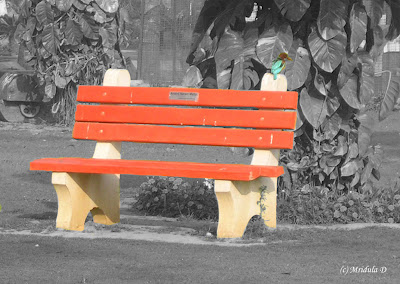
    For the first narrative we are filming a bench shot with two people on it. We took a few photos of various benches to decide upon which would be most suited for the shot we want to achieve.


    We have chosen to use the red metal bench as the colour will give the music video a punk effect. Also we would have the option to film the background in black and white but keep the red bench as a colour accent, keeping up our original idea.

    For the last scenario we are filming either on a beach or across a bridge for the setting where the argument takes place. We took some photos from different angles over a bridge which looked quite effective.


    We are still going to look into whether a beach shot will look more effective or whether other bridges from around weston will be more appropriate.

    Tuesday, 23 November 2010

    Our next steps 3

    We have completed the test filming, storyboard and animatic which means we are now ready to focus on the filming and the promotional pack for our music video. We now need to:

    • Take photos of our filming settings
    • Upload them to blogger
    • Plan production schedule
    • Test some effects out (black and white and colour accents)
    • Start designing the album cover for the digi-pack and advertisement poster
    • Film all the footage with extra shots
    • Start editing