
1) How does your media product use, and challenge the conventions of real media products?
Challenging conventions of a music videos can be a very hazy affair due to the very non linear conventions contained within a music video. Genre and Style are critical elements that constitute towards a music video and the conventions fall in around these two necessities depending on what they are and how they are portrayed in the music. Goodwin’s theory lays out the 8 major principles that are universally applicable to any music video.
Our video stayed true to Goodwin’s theory and his principles in order to ascertain a higher quality real media product that would appeal to the target audience and enhance the viewing experience. We put a high focus on using typical conventions from our genre of music "Pop/punk" this allowed to make an appealing video that would represent the bands image and personal identity and allow the audience to get to grips with the band and the music.
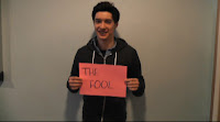
Goodwin’s first theory of “links between music and lyrics” was incorporated in a very predominant style. The lyrics "love" and "lust" are repeated throughout the course of the song, so we utilized this idea of music and lyrics and drew up placards with these 2 words on them and had people hold them up in time with the music. We garnered this idea from, we garnered this idea from the All American Rejects video "Dirty Little Secret" who are a famous pop punk band that use this convention. This also allowed us to incorporate the bands fan base into our video, by using various people that had suited image and musical preference towards the bands own style and genre allowing audiences to relate back to the type audience that may engage with this style of music. This is often done in various real media texts by pop punk bands (such as All Time Low and Boys Like Girls) where these bands are seen playing live to their stereotypical target audience. We needed to film the piece in the style the music would play best to. Our song was fast paced meaning we would need quick cuts and snappy shots. We noticed this was a typical convention in many existing media texts so were keen to incorporate this into our own video. It worked well and allowed the music video to flow and tie in with the genre of music.
We used the convention of "genre characteristics" by rep resenting the band in their typical pop punk attire (bright coloured clothing, skinny jeans, long hair) that represented the bands image. These aesthetics played a key role and really allowed the audience to engage with the band and their genre of music as they had a physical representation of it due to the bands style.
We used lengthy shots of the lead singer so the audience could "get to know" the band and the person fronting it. Many real media texts use this as conventions pop punk bands such as Weezer use timely shots to capture the lead singer and therefore gain an understanding for who is who.
We wanted to incorporate the bands live energy. We saw many real media texts use both narrative and performance based footage together as a convention. We intercut
footage of the placards with the band playing live to utilize this convention and capture the bands energy. This also tied in with principal 8 of Goodwin’s theory "performance based, narrative based or concept based videos"
We also used the convention of links between music and visuals by having close ups of guitars at parts when they suited the music, such as solos and riffs.
Our music video failed to challenge conventions more or less however we did vary certain things such as having the band play to empty space (Ie: no audience was present)
2) How effective is the combination of your main product and ancillary task?
We followed the brief as strictly as possible, it outlined that we had to make a music video combined with a digi pack and promotional material. So we put this brief into motion. Our video was for the song "Love or Lust" by Kids from the Summer, we felt that this was the best song they had written and were keen to help them promote it. We combined this video with a digi pack they included 4 CD panels and a promotional poster.
We had running themes throughout the two products. This meant that the target audience could relate one to the other and see the link between them. This worked effectively and people said to us they could see the link between our video and digi p ack. We needed to incorporate the bands style and genre into both products. We put the individual band members on each of the panels with their name, this let the audience get to know the band and find out who was who. This linked back to our music video as we had them in the same clothing they had on in the video and digi pack. This ensured the audience could see who was who in both the digi pack and video; the two complimented each other nicely. The photos of the band displayed them doing funny poses with colour backdrops and their instruments, this allowed the style of the band to come across in the digi pack. It showed the bands energy and portrayed them as fun and energetic which we felt really suited their music and how they played during the video.
We wanted to show continuity between the video and text in the digi pack. We did this by using a photo of the lead singer’s tattoos (Love and Lust on each wrist) and attempted to mirror this on the back of the CD which also used a swirly style of font. Colouring was an issue for us during the process of the front cover. At first we used very dark colours (predominantly black) to surround the singer’s wrist and bright red for the font of the tattoos. We felt this did not represent how the band were in the video and made their genre seem more "Gothic" and "Emo" so we toned the black down and made it more of a blue colour and the red less intense to portray the band in a more light hearted way that represented their genre. For the poster we used a slightly different font to as we felt the curly, swirly font did not represent the band quite how we wanted we used the font "Sketchbook" which we put in colourful style and slanted positions to further emphasise the bands energy they showed in the video
Here is the singers tattoo as featured in the video:

Here is the redraft of the singers tatooe we edited in Photoshop, once we had taken a picture of it:

The blue in much more predominant the image represents the song well as it contains it primary links, it worked efftively as the tatooe is seen in both the video and the digi pack making a clear link between the two. Here is our poster depicting the font:
 As you can see the poster heavily features orange, purple and yellows as a predominat font colour, we got inspiration of this from a previous font the band had used on an EP they had released a while back:
 Ti imporve continuity we could have incoperated more of the features of the video. These include the placards and the fanbase, we could have had a different fan on each pannel holding up a placard with one of the band members names one, or have multiple placrds with different lyrics from the song on as the front cover. Altogether I feel we did a good job at making a clear link between our digi pack and our video, the bands style was seen in both as was the running theme of font, the use of colours (As seen on the placards and the font in the digi pack) and the enery the band have (in the video playing live and on the still photos of them doing funny poses)
3) What have you learnt from your audience feedback?
To assess the effectiveness of our media product we needed to gather an adequate range of opinions on our music video, both positive and negative in order to evaluate the quality of our product. We did this by showing people the music video and getting them to write down things they liked and things they didn't like. This way we could see the pros and cons of our product, what we did well and how we could improve in future tasks. We asked many different people: students from our media class, some of our peers around the college, the teachers, family and finally people we thought would like the type of music the band played or similar artists to them. This we could gather different perspectives from different typed of people to get an unbiased and reliable set of opinions.
Here is some of the positive feedback we ascertained:
- Good band shots
- Effective setting that suited the style of the music
- I like the placards with the words
- Quick editing was effective for the pace of the music
- Simplicity was effective
From this feedback we can see the shots we used were effective; we used a wide range of shots in the video (High angle, low angle, close ups, mid shots, tracking shots) these shots combined with the quick cuts (which was another positive from our feedback) paced the music out well and allowed the music video to come to life and feel energetic and lively. For our setting we chose to film the bands performance on Worle schools stage. This was the perfect setting for a performance, the stage added realism to the live action, and it was a believable setting and contributed a concert like atmosphere to the bands performance. It also had a colourful backdrop that we felt added colour to the performance and made it look more aesthetically pleasing. The use of placards was also complimented on, we thought these would be a good opportunity to introduce the bands fan base and allow the lyrics to link in with the music, this also kept the video simple and people could relate to it and understand what was happening (as said in the feedback)
Here is some of the negative feedback we ascertained:
- Repeating shots too much
- Using the same person with the cards was noticeable
- Placards looked as though you were filling space
This feedback has shown what we can improve on if we ever do a similar project. Narrowing down the number of similar shots will add more variety to our project and keep the audience more interested; in future sticking to our storyboard and hot list will provide us with important shots we can use to get different aspects of the band onto camera. We should have also improved out editing techniques and taken better advantages of the technology at our disposal to make shots with the same person in look less duplicated and add an effect or something to differentiate to two. We should have also filmed more footage so we wouldn't have to use the same shot twice. In order to address the "filling space" feedback, we felt we shouldn't have rushed the video as much and taken more time and care over it, we had to ditch the original idea on our storyboard due to time constraints. Making sure we are on track to reach the deadline at all times will prove beneficial in garnering the required end project we want to achieve.
4) Have you used new media technologies?
We used a variety of different programmes and web based engines to create our media product, these enhanced the quality of our media product and allowed us to do thing that would not be possible in reality.
Blogger:
The first piece of technology we really utilised was "Blogger" this is a web based blog programme that allows you to record all the work you've done towards you project in one place that you can look back at and present your work on. This was particularly beneficial during the research as we could embed videos and refer back to them whilst making our video. The technology also allowed us to present images and stills of idea we liked or screens from our music video we could then write about why we had chosen these shots which was very helpful towards making our project.
We could display information in different ways on the blog a popular way of doing this was using the website "Wordle" to create a mind map like display of ideas and relative words about our music video, this made recording data more interesting for people reading the blog and added colour to the site.

Filming Equipment:
We had a wide range of technology as our disposal for filming, we had HD cameras that displayed high quality footage and allowed us to film with much better resolutions. The camera also contained different effects we could use and built in options to enhance filming. The cameras contained micro SD cards; this was a far more efficient way of capturing footage and was easy to upload onto the Macs via Final Cut Pro's log and transfer method. We could also take still images using this camera which was ideal for taking shots of our location shoot. We also had brand new tripods which allowed us to get various angled sots and keep the camera steady whilst we could be checking up on other things whilst the camera would continue to film in the required position. On the day we had access to large sound system to play the music through and allow the band to mime to the music video easier, this made the video more realistic and believable. The stage also contained high tech lighting which really enhanced the quality of our footage and made it look very professional.
Editing technology:
Final Cut Pro was a crucial part of our editing. It allowed us to upload all of our footage onto the programme and place in the order it should assemble in. We could put a layer of audio into the programme, we utilised this by putting our song into the programme and syncing the shots in time we our music. The programme was very useful when shortening the length of the song; we could cut parts out and add linking bits in to make the song shorter, yet keeping the editing seamless. The effects allowed us to fade out the song so it would not end abruptly and also allowed us to put light filters and colour enhancers onto the footage to make it seem more professional.

Here is a typical display of Final cut pro, here you can see the use of the fade out and the layering between the image and the audio, we could also determine the length of each shot on this programme and could place them into position.
When filming the placards we noticed various things could be seen on the walls where we had filmed, this detracted quality from the video so we used Final Cuts crop tool makes the shots slimmer and cut anything out of the shot that took away from it.
Here is the before and after of this:
 As you can see the shot is a lot more streamlined and much more asthticaly pleasing.
We had also planned on useing Final Cut Pros use of effects to add colour accents to the video, but ditched this idea due to time constraints.
Digi Pack and Poster:
We predominantly used Photoshop in making the digi-pack. It allowed us to enhance the look of photos and create different styles to display them in. We were able to add a panelled to display to our CD casing and filter certain colours to enhance the look of the back of the CD. We also used Photoshop with the front cover. It allowed us to de-saturate the colour of the Lead Singers tattoos and add in a newly coloured background. We could also change the colour of the Tattoos font, this would not have been possible without Photoshop. We garnered the fonts used in our dig pack from the website "Dafont" we could save the fonts we liked and import them into Fontbook, this way they were useable on Photoshop. The fonts we chose reflected the bands style and the genre of their music and worked effectively with the digi-pack
No comments:
Post a Comment